ESPN's Migration Playbook: The Move to Figma with One North
By Matt Rogers
Config is Figma’s annual global conference for designers and the people they collaborate with. It draws thousands every year for hands-on workshops, technical sessions, and major announcements about the future of design tools and collaborative creation.
I’ve had the opportunity to design Config presentations over the last three years, for three different speakers from the One North design team. My job in each case wasn’t to stand on that stage; it was to make sure my colleagues who did felt confident by arming them with engaging slides, animation, and a tighter narrative arc.
Along the way, I kept coming back to something Suchitra Parikh, Director of Storytelling at PayPal, said in a conversation I watched recently. Her point was simple: every presentation is an act of persuasion. And, if that’s true, then design in this context isn’t decoration for the story. Design is how the persuasion shows up visually.
When you’re speaking to a room full of people who make beautiful things for a living, you’re not just being measured on what you say; you’re also being judged on how it looks. I took that as a personal challenge to create something special each time.
Suchi’s framework gave me language for things I’d been doing instinctively for years. Two ideas shaped how I approached all three talks, and both show up again and again in the case studies below.
Before any slide gets built, you need to know the one word or outcome you’re driving toward. That word becomes the filter for every decision after it.
I’ll come back to each of these words as we reach their talks because the words shaped the visuals, the motion, even what got cut. Sometimes the most important storytelling decision is determining what doesn’t make it on stage.
Complexity is yours to remove, not the audience’s to decode. This idea is great advice for speakers, but it’s even more useful as a design rule. If a slide requires the audience to do work to understand it, you’ve already lost them to the bullets on the screen.
Figma’s editorial team put it well in a blog post on storytelling: the right approach isn’t what you want to say; it’s what your audience needs to understand. Each of the three talks is built on that idea, with one strong visual metaphor doing the work that a wall of bulleted text never could.
These are the rules I keep coming back to every time I build my presentations:
The method I’ve developed isn’t something I designed from scratch. It just became a habit across enough presentations that I started to notice a pattern.
First, I meet with the speaker and have them walk me through their story. As they talk, I’m listening for two things: the single word that the whole talk is really about, and the visual metaphor tied to it. From there, I find the most impactful beat and build everything else in service of that one moment. The slide design that follows is almost always an act of subtraction. I lay it out, then keep removing things until what’s left is simple. Motion keeps that simplicity from feeling flat. The simpler the slides are, the more room there is to play.
Then I walk away. Whatever felt clever mid-design usually looks like it’s trying too hard when I come back with fresh eyes. What survives is the thing that’s actually serving the story, and the core idea. With that in mind, here’s how it played out across the three talks, starting with the one that set the tone for everything that followed.
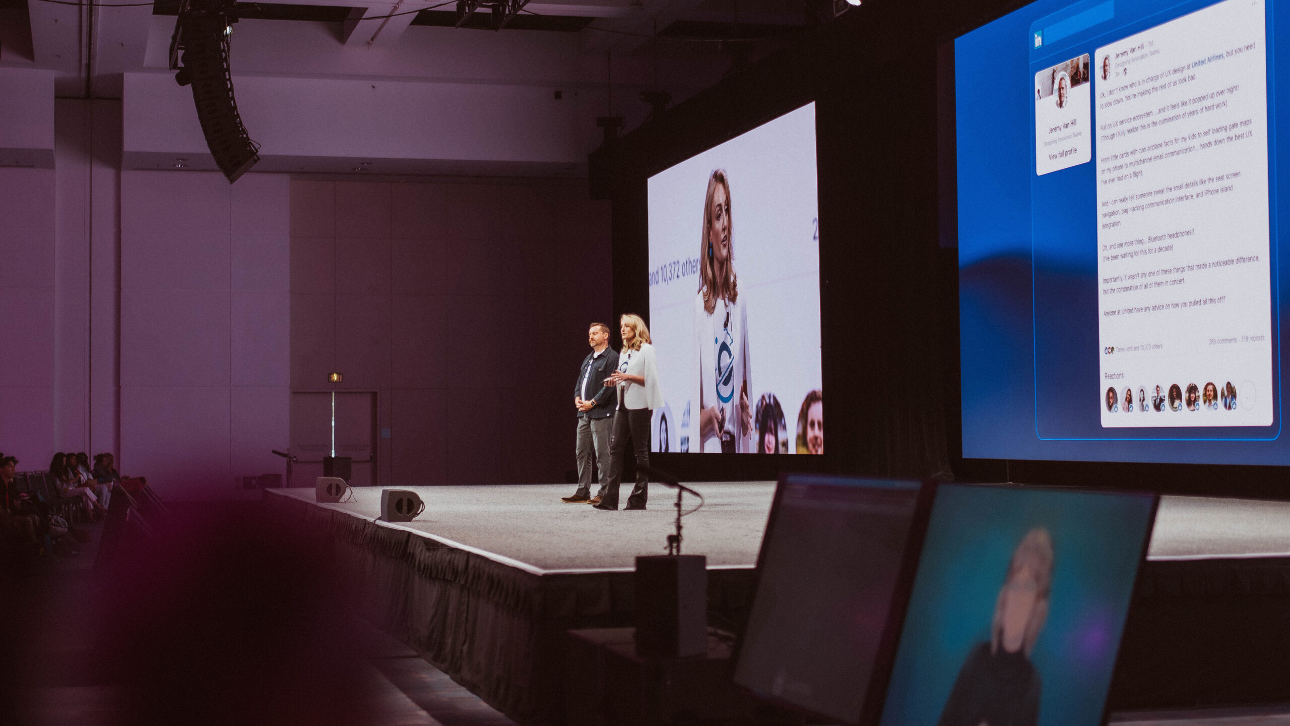
The word here was Trust. In 2024, I worked with Jessica DeJong, Managing Director of Design at One North, on a talk she co-presented with Derrick Wilkinson, Director of United Airlines’ EUX team, about United’s 16-month migration of their ORION design system into Figma. The talk’s central metaphor was a physical office move: stakeholders care about structural questions; employees care about where they’ll get coffee. Both concerns are valid, so a good migration story has to speak to both. The design had to carry that same dual awareness.
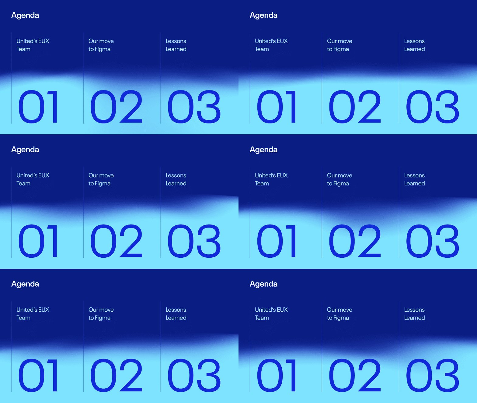
The visual anchor came from soft, shifting gradients that felt like being above the clouds, a state of mid-transition, where the plane has departed and hasn’t yet arrived. It mirrored the emotional state of a migration in progress, and reinforced Trust as the core word, since trust was built between One North and United as they underwent this migration.

The talk also needed a timeline to track 16 months of milestones, too long a span to fit on one slide. So, I built it to slide in from the right as the story progressed. It’s a small piece of motion, but it’s a good example of animation earning its place.
The milestones mattered as much as the motion connecting them. It showed that the team was rebuilding the plane as they were flying it, making the above-the-clouds metaphor more literal.
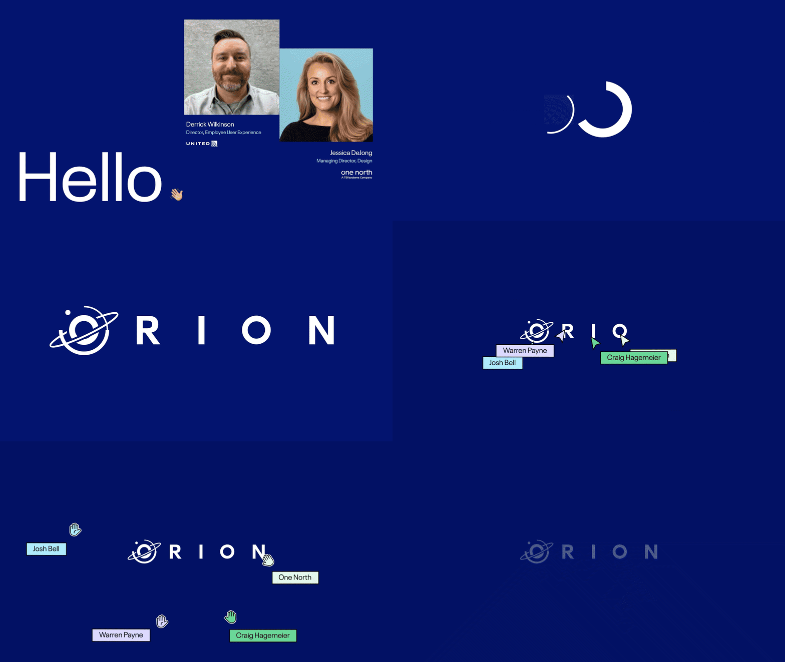
The bookends are what I am most proud of. For the intro, I enlisted our motion designer, Kate Burford, and together we animated Jessica and Derrick’s company logos morphing into the ORION design system logo in After Effects, a visual handshake representing the partnership. For the close, I animated Figma’s multiplayer cursors across the screen, one per United team member, each carrying a piece of the ORION logo until they met our One North cursor for a high five. Getting that timing right, so it actually matched the real Figma high-five animation, took many rounds of iteration. It’s a small detail, but designers in the room recognize those cursors. Using them to close the talk tied the entire migration story back to the product — and back to the word the whole thing was built on, Trust.
The word here was Access. A year later, I worked with Nick Villapiano, Director of Front-End Development at One North, on his talk about using web components to give developers a way into Figma’s Simple Design system regardless of their front-end framework. His core analogy: web components act like a USB cable for the web, universally compatible, plugging into whatever framework is running. Where Jessica and Derrick’s talk was about earning trust over time, Nick’s had to prove that you could still interface with your design system components in Figma, no matter your architecture.
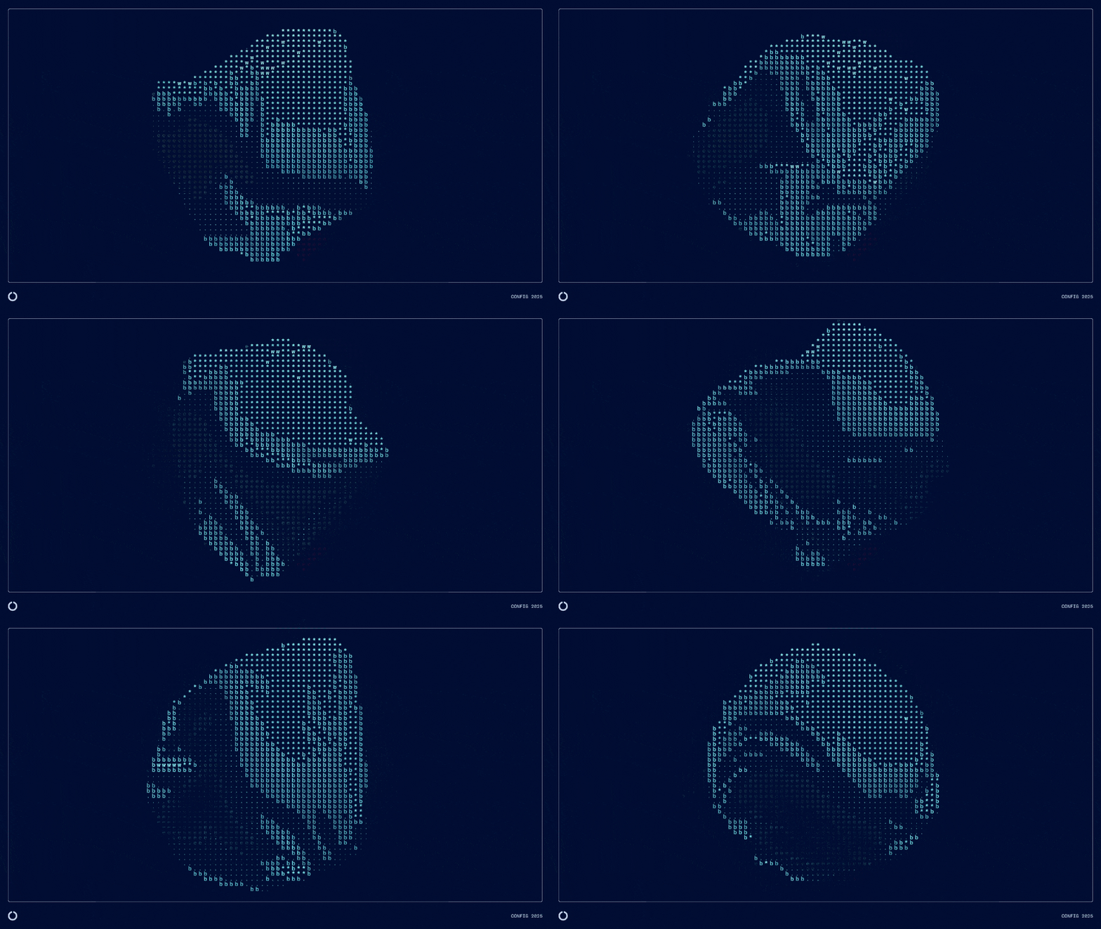
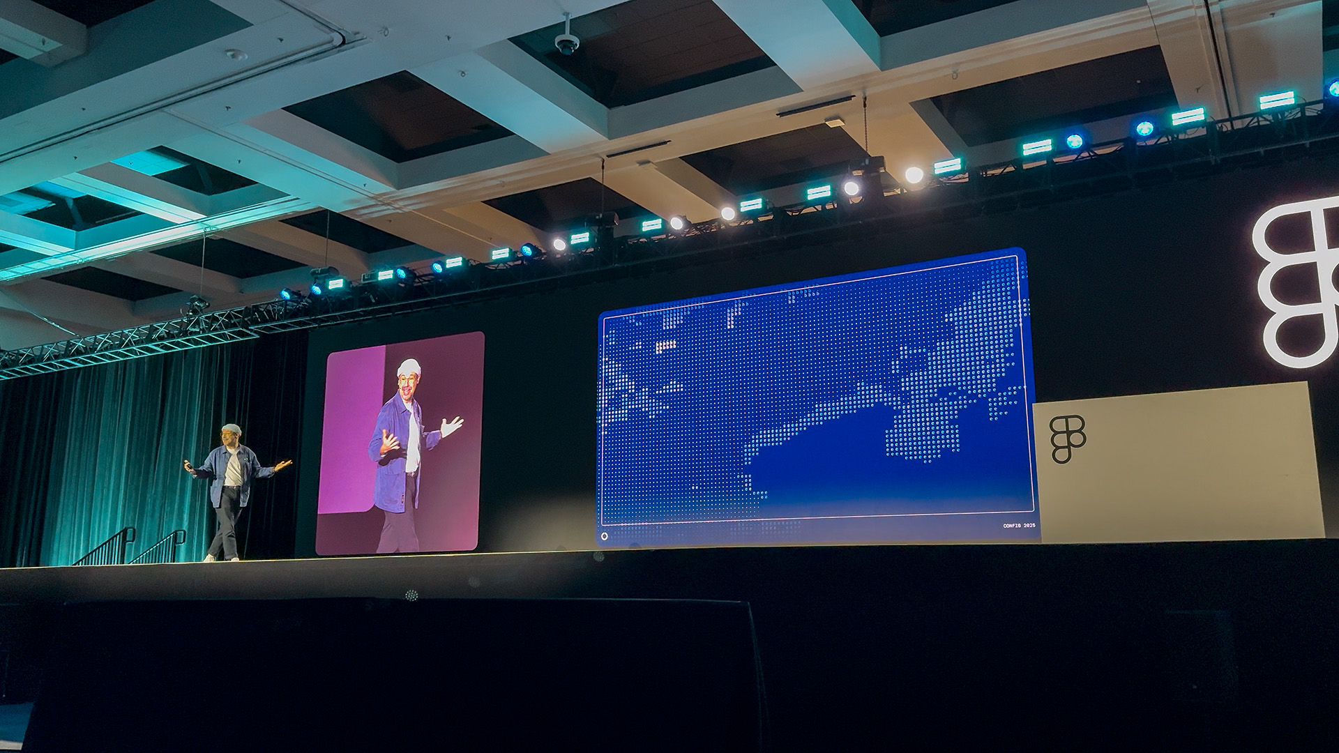
The visual anchor came from ASCII art that lives in our onenorth.com source HTML. Markup and code rendered as living, breathing imagery felt like the right way to visualize a connector fluidly tapping into multiple frameworks.
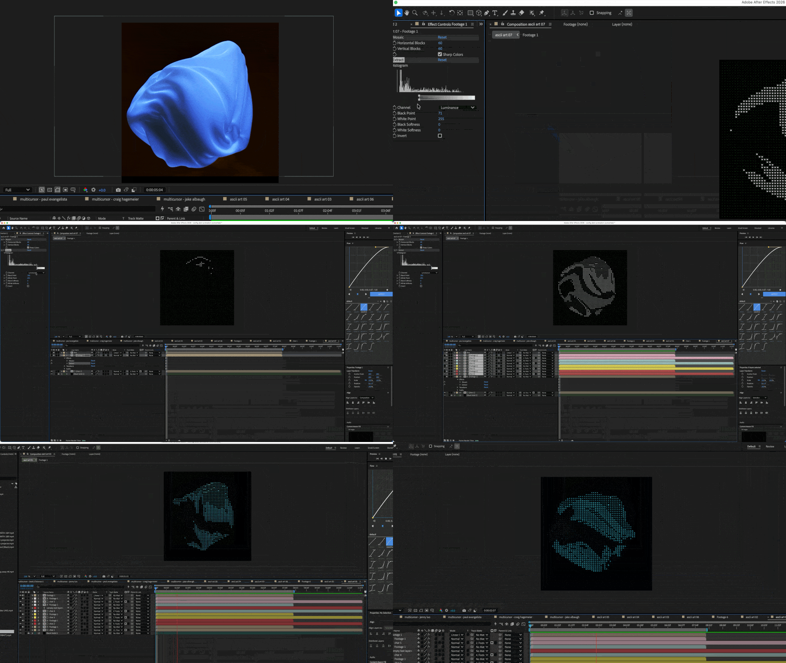
The technique is worth unpacking, since this is the kind of craft that doesn’t show up unless you go looking for it. It starts with a grid built using the Mosaic effect paired with Repeat Tile in After Effects, which creates a responsive tiled layout. The Extract effect isolates grayscale values from the source footage, so different shapes appear based on the brightness of the underlying layer. Swap in ASCII characters, custom shapes, or graphics as the tile elements, and you have a grayscale map driving a dynamic grid in real time. A Tint pass pulls in color. The result reads as effortless motion, but it’s really the same logic as the talk itself: a framework that mirrors the USB analogy — one source, multiple outputs.
This was also the first of the three talks built in Figma Slides (Jessica’s was built in Keynote).
The word here was Buy-In. This year, I worked with Matt Rogers, Manager of Product Design at One North, on a talk he co-presented with Elliot Muñoz, Creative Director of ESPN Creative Studio, about migrating ESPN’s universal insert framework, the on-screen graphics layered over live game footage, from Photoshop to Figma. The scale is what makes buy-in the real challenge. ESPN covers over 50 sports and leagues, roughly 7,000 individual insert designs once you factor in every team, every player, and stat, ballooning into the trillions when you consider all the combinations.
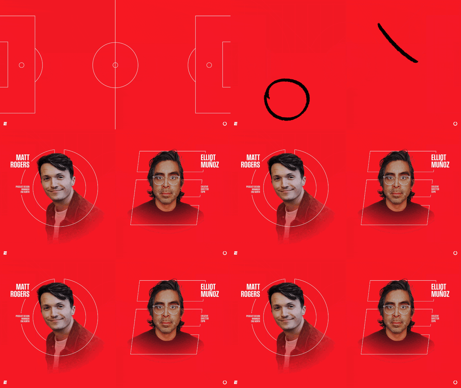
Matt framed it as a football metaphor: a receiver catching a kick and running it back through a wave of oncoming defenders. That’s how the migration felt, an onslaught of obstacles coming from every direction. That is exactly why the playbook aesthetic made sense as the visual anchor — marked-up X’s and O’s and handwriting paired with bold headline type. Emi Tolibas, a designer on my team, took the lead on the visual language and hand-drawn elements that gave the presentation its character.
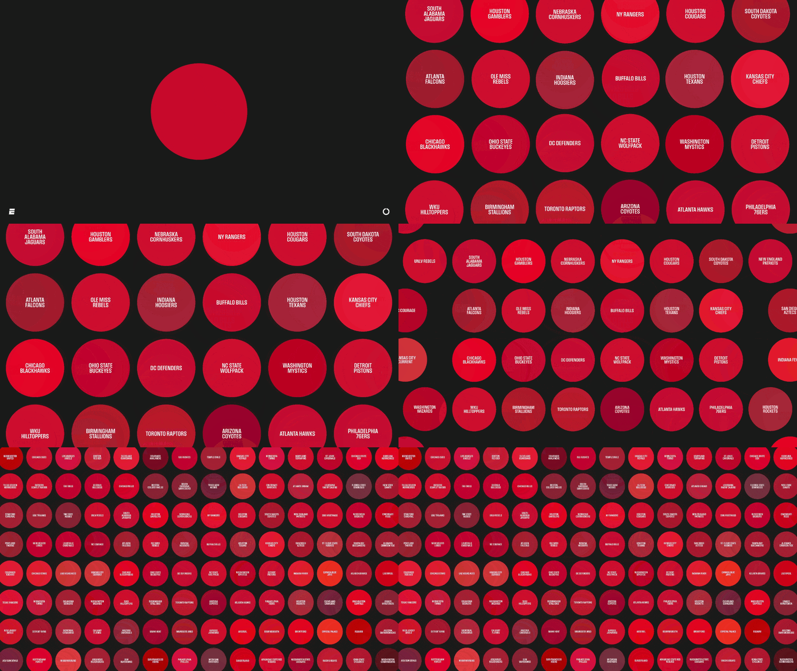
The moment I’m proudest of made an abstract point concrete. Matt noted that something as simple as the color red gets complicated fast when hundreds of teams each have their own legally distinct shade. I built that out as a single dot on screen, then a few more, then a zoom out into a dense grid of hundreds, each a different red from a different team or sport. The craft was in arranging each dot so that Smart Animate, Figma’s equivalent of PowerPoint’s Morph, moved them intentionally. Get it right, and the audience feels the scale of the problem the same way Matt and Elliot’s teams did when they first ran into it.
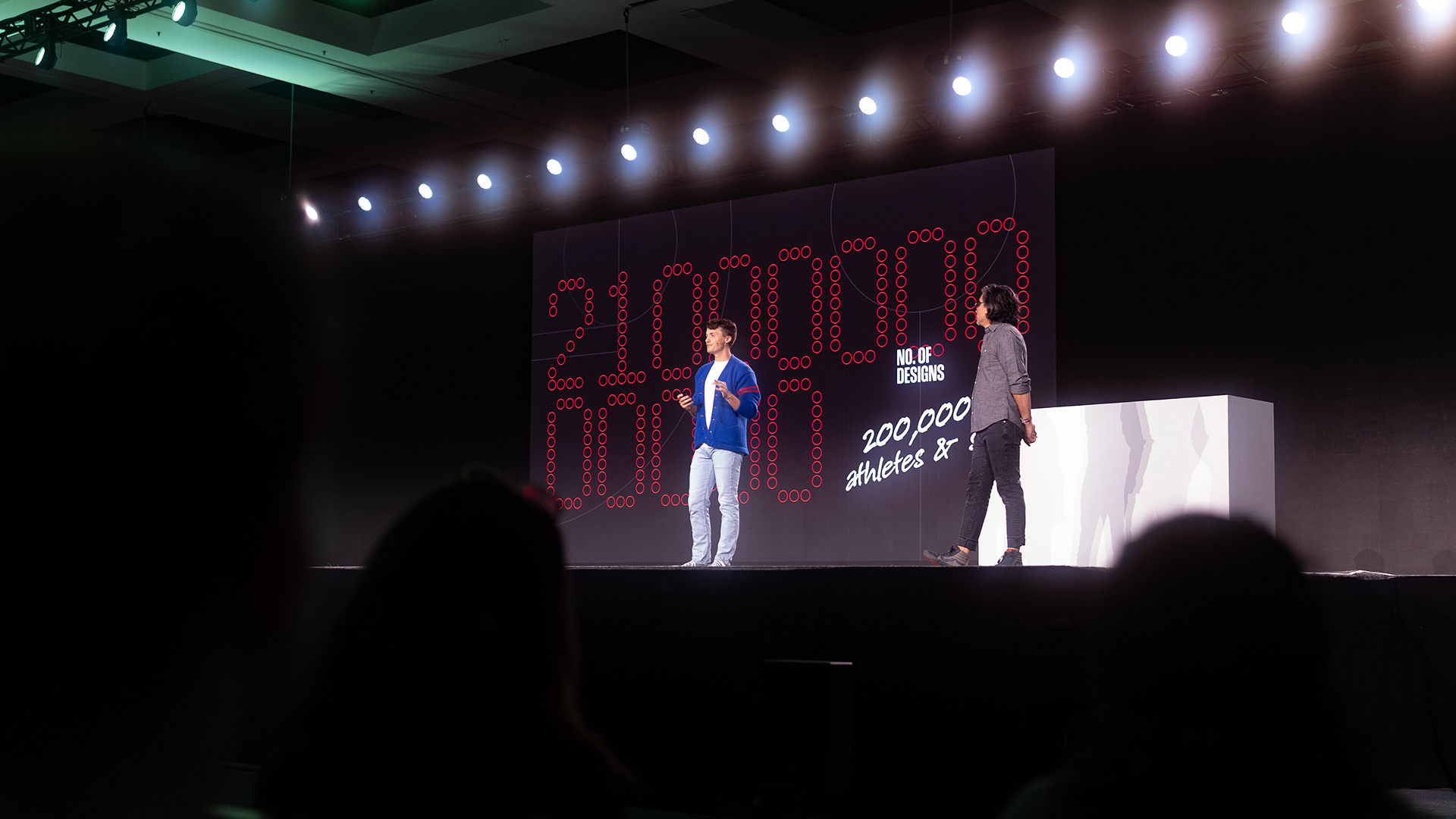
Across all three talks, the moments that made people lean in didn’t come from the native tools. The multiplayer cursors, the ASCII grid, the hand-drawn playbook elements all came from going further, into After Effects, into custom illustration, into building something the tool itself doesn’t hand you by default. That extra step is where craft lives, and it’s also where each talk’s one word — Trust, Access, Buy-In — actually became visible.
Suchi put it well: audiences connect to energy and conviction more than they connect to data. At Config, that conviction has to be backed by craft because this audience knows the difference between confidence and polish. Polish is a slide that follows a template correctly. Confidence is a slide that makes a risky choice because it serves the story, like building a thousand-dot grid just to prove a point about scale. A room full of designers has made that template-correct slide a hundred times. What earns their attention (and respect) is the choice that requires someone to actually decide something.
Here’s what I’d tell any speaker prepping for a high-stakes talk:
Every item on that list points back to the same truth: none of it is fast. The visuals across all three talks looked effortless, but each one took many hours of iteration that the audience isn’t privy to. That time is the craft. Figma CEO Dylan Field said something at this year’s Config that put in words exactly what that time buys: AI has lowered the floor, but it has not raised the ceiling. Designers, creatives, and builders are the ones who raise it.
Everyone can generate a passable presentation with AI now. The ceiling, the height of what’s genuinely expressive and original, only moves up when someone with taste pushes on it. Everything I built across these three talks lives at that ceiling, not because the tools were advanced, but because I spent the time making judgment calls behind every one-word filter, every visual metaphor, and even what got cut.
A few of the announcements from Config 2026 point to where that time gets spent next:
If these land well, a meaningful chunk of what sends me into After Effects could happen inside the deck. That won’t shrink the time, but it’ll raise what’s possible with it. Someone still has to know what’s worth building and why. Working with a speaker to get that right before standing in front of thousands of creative people carries its own pressure, even from off stage. But it’s also the best proof that storytelling and design are worth taking seriously.
Jessica in her Assembly talk last year references a centuries-old line from mathematician Blaise Pascal to emphasize the importance of editing:
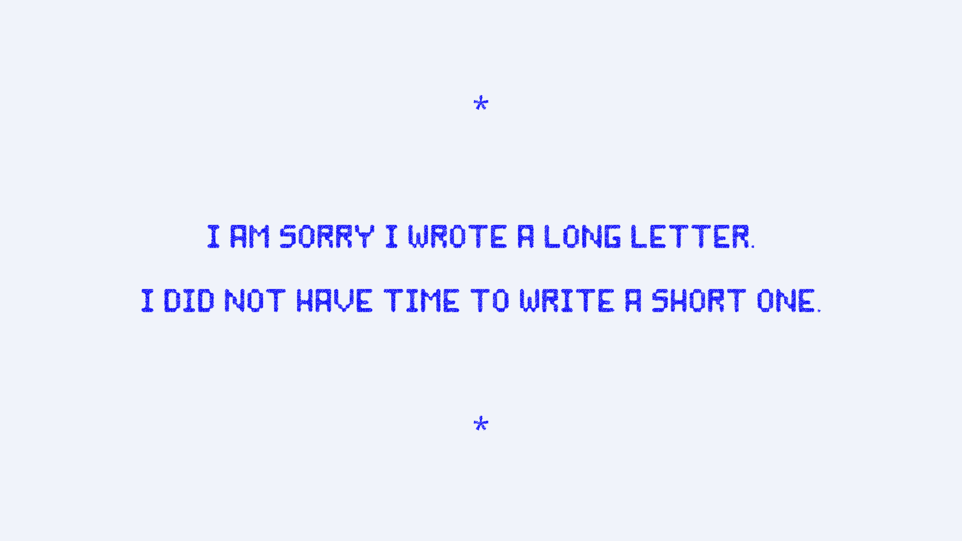
It wasn’t written about presentations, but it might as well have been. Every talk got better the more I took away, and that’s the whole secret, really. Story first. Then make it beautiful.