Alchemy and Human Experience: How Collaboration Creates Change
By Ryan Schulz
Some of the most memorable parts of an event aren’t the things attendees can easily point to. They’re the feelings created when hundreds of intentional details work together. For The Assembly 2026, that idea was our design philosophy and our theme.
Inspired by the ancient concept of alchemy, the belief that something extraordinary happens when individual elements come together to create something new, we set out to create a visual and physical environment where innovation, human craft, and a strong sense of place could translate into an experience.
In ancient times, Alchemy focused on transformation like turning base metals into gold or unlocking the elixir to eternal life. At the Assembly, the transformation was the innovation on everybody’s mind, Artificial Intelligence, and the power of humanity in our everyday work. The elements of alchemy: Earth, Air, Fire, Water, and Ether, became an inspiration for the visuals, content, and guest activities.
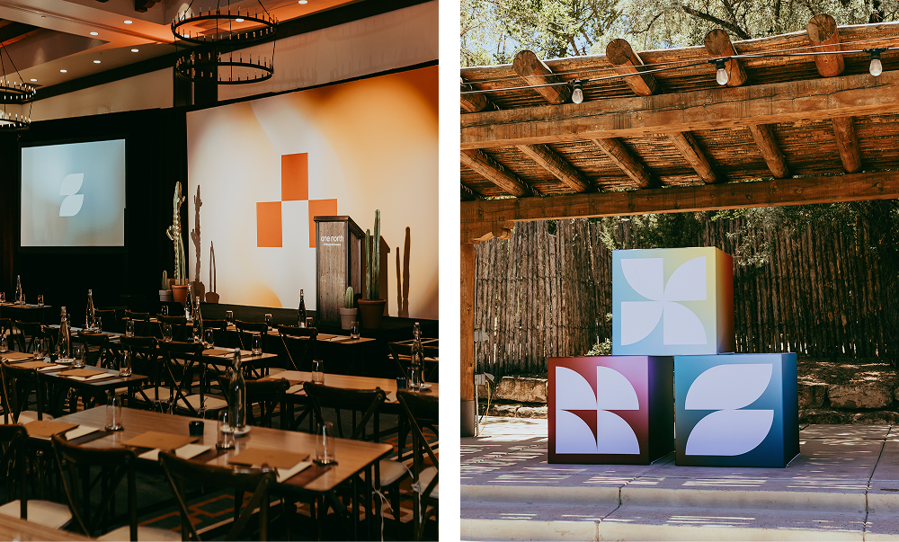
This was complemented by this year’s location, Bishop’s Lodge in Santa Fe, NM. We pulled inspiration from the landscape, artistry, and spirit of the area to inform the foundation of our visuals.
The location set the tone, and the theme told the story that every design decision and detail was built upon, including foundational components such as the element icons, color palette and gradients, and graphic frames and patterns.
To capitalize on the collective whole, we chose to create abstract icons for each element, all derived from a single motif: a circle. Using the four quadrants of a circle rotated individually, the element icons were created. Each one has a symbolic representation, but, more importantly, all seamlessly transform into one another, just like they would in true alchemy.
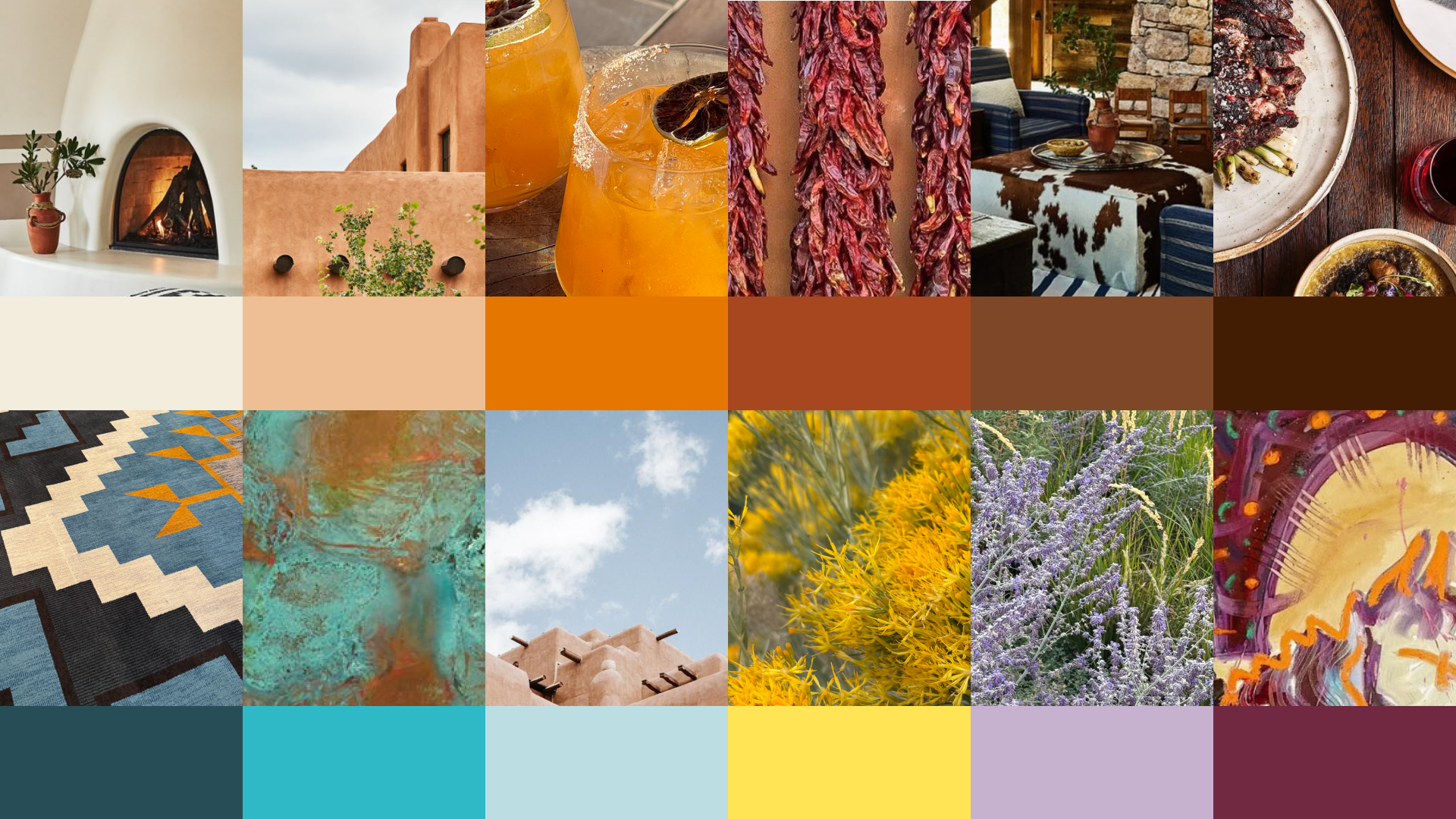
Santa Fe and the Southwest have a strong visual palette. For our event design, we wanted to cohere rather than distract. Design took inspiration directly from Bishop’s Lodge, capturing color from the decor, local flora like lavender sage, the resort’s signature apricot margarita, and the art on property.
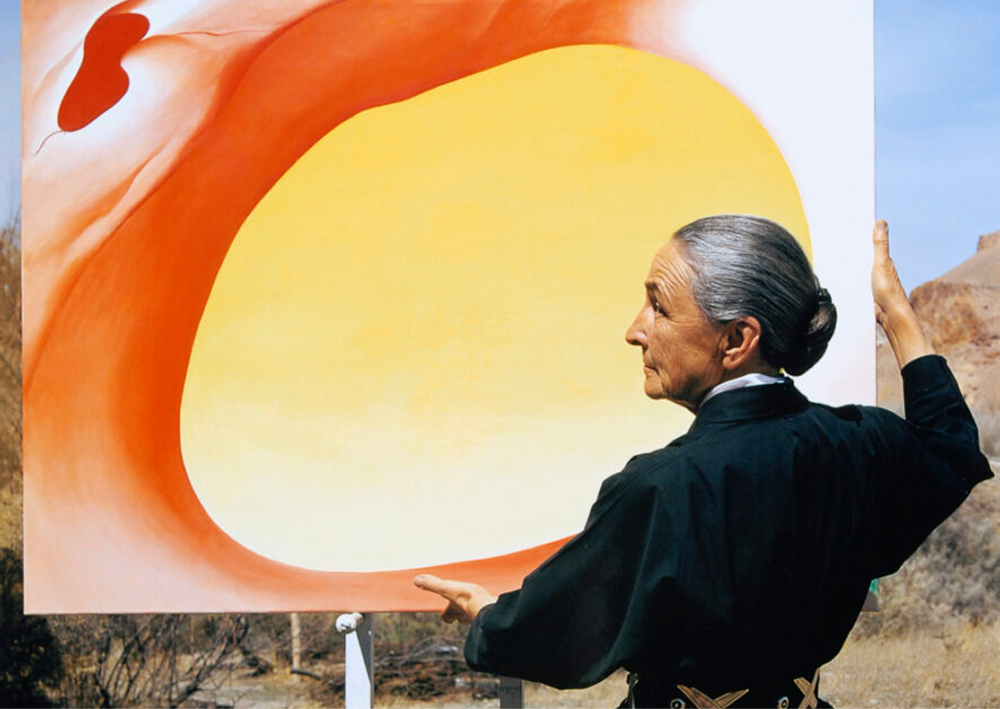
Photo Credit: Analysis of “Pelvis Series, Red with Yellow,” 1945 – The Georgia O’Keeffe Museum
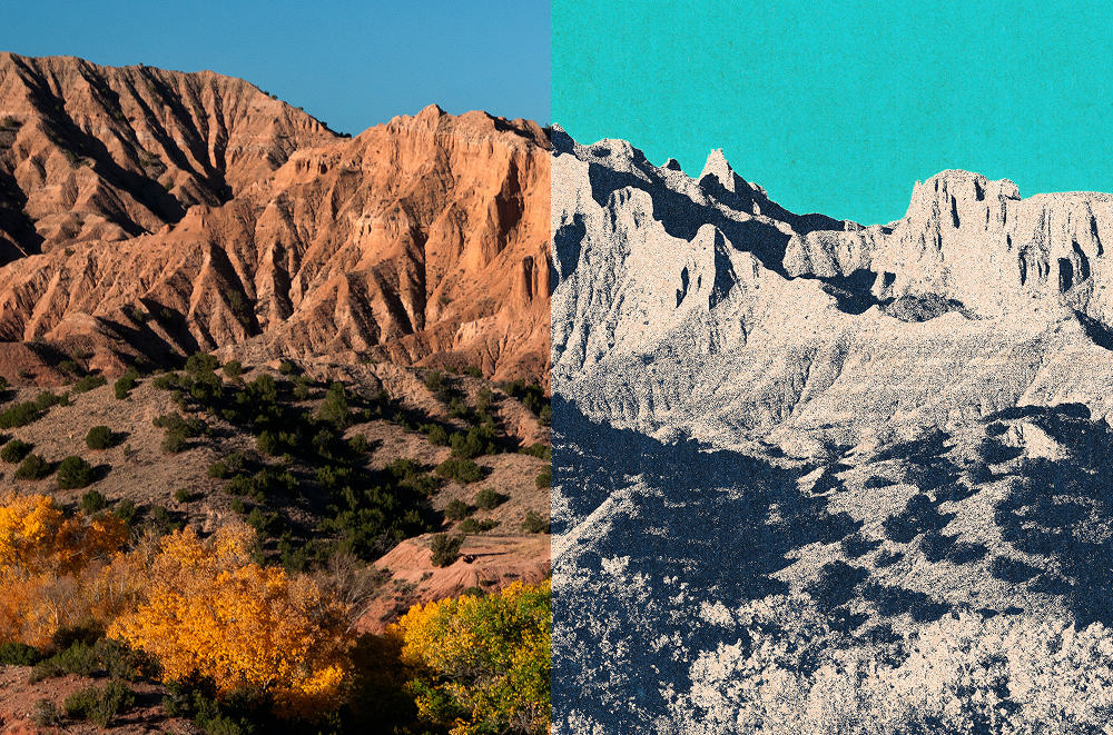
Inspired by the interplay of light and shadow in Georgia O’Keeffe’s work and the magical feel of melding colors, we decided to create expressive gradients with the palette for each element. Each gradient had an extra dimension of grain and noise meant to represent particles cohering to create an orchestration of color. This decision also translated to the signature photo filter inspired by Risograph printing techniques.
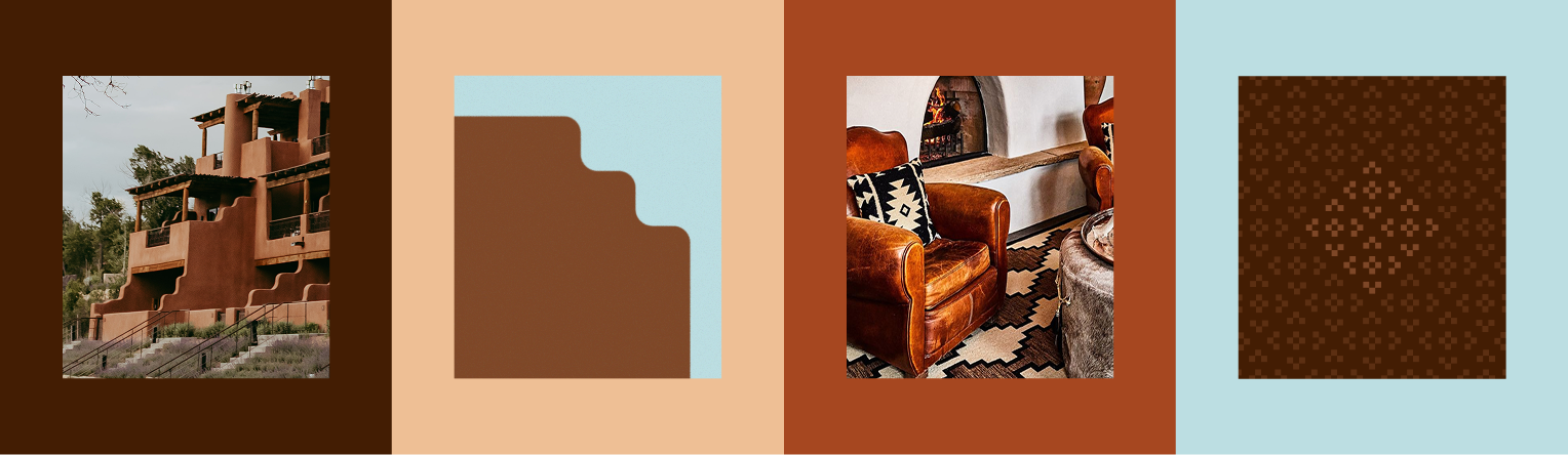
To further infuse customization in the graphic language, we designed a framing system as well as a pattern incorporating the Assembly logo. The frame system nods to the curves and decorative edges of adobe architecture, while the pattern references the traditional southwest textiles seen throughout New Mexico.
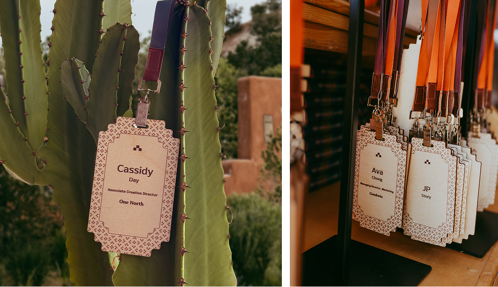
These visuals were carried throughout the digital and physical touch points. Both the frame and pattern were used in this year’s name badge, which was printed on wood to match the location’s natural materiality. The badges were paired with full gradient lanyards to pull color into the final product.
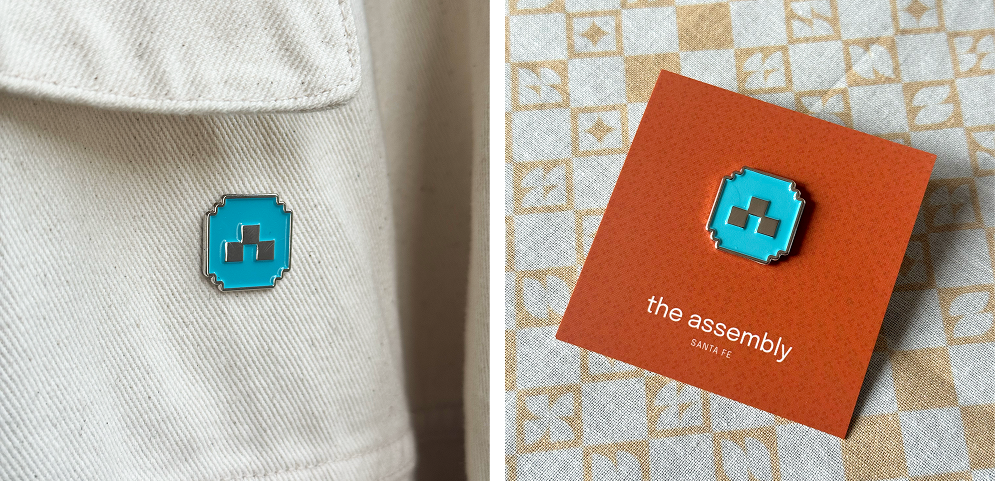
The frame was also a key element in this year’s signature enamel pin. Turquoise and silver were the selected materiality to mimic the jewelry style popular in the area.
With the visual language established, the next step was translating it into experiences people could interact with.
The registration site became the first expression of the theme. Using an interactive shader built with ThreeJS, the site’s gradients responded to movement and hover states, creating a sense of transformation and discovery. Even buttons felt dynamic, drawing users in through subtle magnetic interactions

Another part of our rollout to attendees was a short video to introduce the theme. Here we were able build on visual identity through motion, with a focus on how light and shadow could create dimensionality, and footage and imagery build excitement and introduce attendees to the world they would be entering.

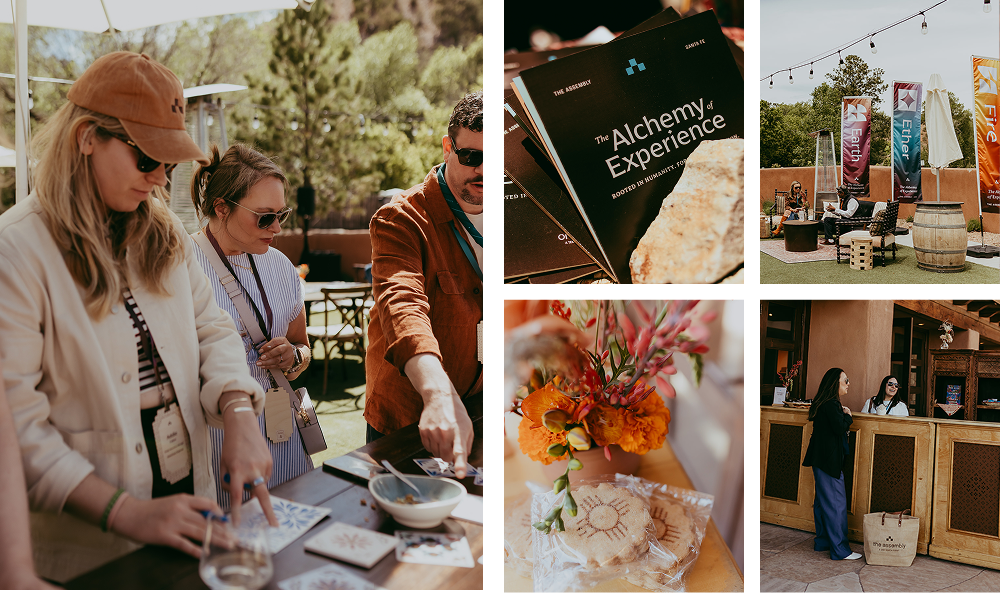
Guests were welcomed with tile making and handcrafted pottery from Paseo Pottery, while Tarot-inspired cards guided workshop activities. Throughout the experience, moments of human craft balanced conversations about artificial intelligence, reinforcing the idea that innovation emerges through the interaction between technology and people.
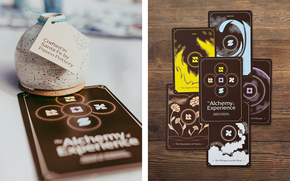
The illustration style echoed the theme, using textured brushes and layered forms to represent smaller elements converging into something larger.
Signage activated the event spaces, both inside and outside, and local cacti brought dimensionality to the setup.
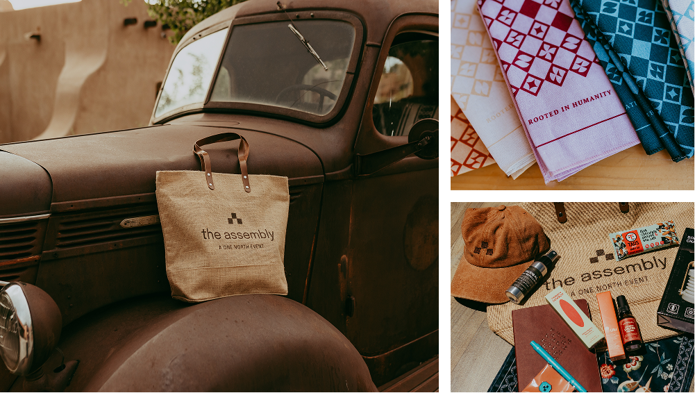
Jute gift bags, reflecting the venue’s natural, rustic setting, felt right at home. Inside the bags, guests found welcome materials and a high-altitude survival kit including granola bars, bug spray, and hand sanitizer from local New Mexico companies as well as a solar-charged lantern for the dark nights. Custom bandanas and hats made guests feel like part of the experience right away.
The Assembly is an experience that shows that design is about more than what people see; it’s about what they feel. By blending innovation, human craft, and a strong sense of place, every element worked together to create an immersive, memorable, and meaningful experience. In the end, the magic wasn’t in any single design detail, but in how they came together to create a lasting emotional connection.
To see more on how the visual identity, environments, activations, and attendee touch points came together to create The Assembly 2026, explore our photo gallery or watch this year’s video to see the design elements in action.
Ready to dive deeper into the ideas that shaped Assembly 2026? Explore session recordings and revisit the conversations, insights, and perspectives shared throughout the event.
As Associate Creative Director, Cassidy works on a variety of projects across our client portfolio. Her skills and interests are always evolving, but her constant is a passion for community and human-centered design. Cassidy’s experience amplifying brands through event design, environmental design, and campaign work allows her to apply her unique perspective and love for details across all mediums to ensure a consistent story for our partners.